Info

@ The H&R Block Artspace at the Kansas City Art Institute

16 East 43rd Street : Kansas City, Missouri 64111

April 19 – May 17, 2008 –>Closing reception: Friday, May 16, 6:00-8:00 pm

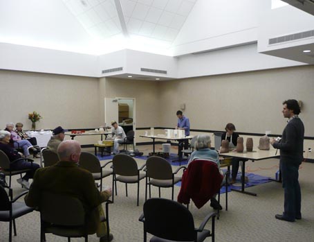
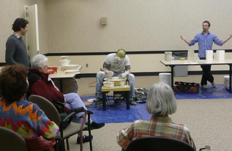
The 2008 Annnual B.F.A. Exhibition features work by nearly 100 candidates for the Bachelor of Fine Arts Degree from the Kansas City Art Institute, majoring in Art History, Animation, Ceramics, Creative Writing, Digital Filmmaking, Graphic Design, Interdisciplinary, Fiber, Painting, Photography, Printmaking, and Sculpture.

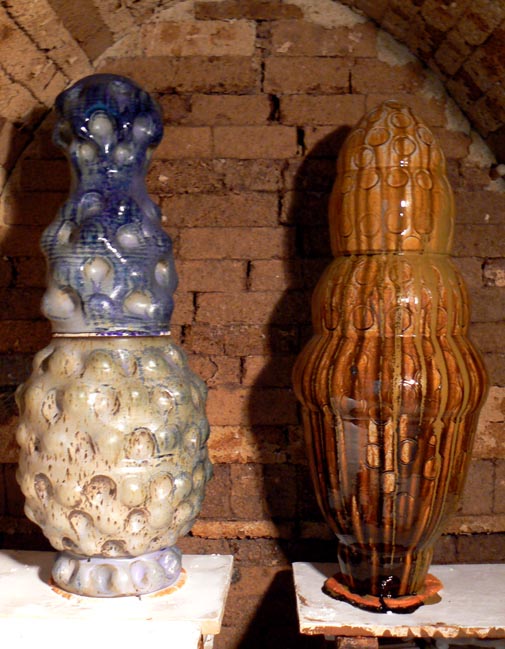
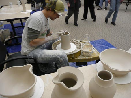
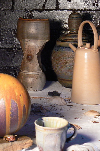
above: My contribution to the exhibition, Double Lidded Jar (after prehistoric fertility figures), installed in the 2nd floor gallery space

dimensions: (25.5″ x 10.5″ x 10.5″)

Artspace T.N.T. (The Noon Thing)

Friday, May 16, NOON

Graduating Art History & Creative writing majors will be reading excerpts from their contributions to Compendium 2008: The Survival Edition. I will be reading an excerpt from a research paper on Hans Coper & Lucie Rie. Copies of The Survival Edition will be available at the Artspace during the reading, $10 for students and $20 for everyone else. This year’s edition of the Compendium comes packed in a kit, and includes some things you might need to survive. Fourteen contributing authors are featured in their own individual booklets, an audio compact disc with 11 tracks of magic, and one of Phyllis’ favorite poems are stuffed in the tin along with some other surprises.

This past Saturday, April 5th, an exhibition titled “Ahead of the Need” opened online to benefit the Craft Emergency Relief Fund (CERF). The invitational exhibition was curated by Anthony Schaller & Lana Wilson. The show is online for viewing on Charlie Cumming’s website (www.claylink.com). It is a great opportunity to buy pots with the proceeds going towards a good cause! Click here to link directly to the exhibition… The exhibition runs through April 30, 2008.

(Below: Double Lidded Dimple Jars, Soda Fired, 2008 )

TF01 Dimple Jar

TF02 Dimple Jar

On February 14th, Brock DeBoer, Gabriel Reed and I trekked out to the Epsten Gallery at Village Shalom to participate in their Artists On-Site demonstration program. We presented an afternoon of ceramic wheel-throwing and slip casting demonstrations to the residents of the retirement community and members of the ceramics community and public who were in attendance.

The demonstrations were held in conjunction with the exhibition Remembering Beauty: The Ceramic Work of Victor Babu. The three of us set up mini-studios in the social hall at Village Shalom. The audience arrived before we had even finished setting up! We introduced and explained specific techniques we each use in our own work, as well as materials and tools for creating wheel-thrown and press and slip mold processes. The audience asked us all sorts of questions… ranging from the technical aspects of working with ceramics to why and how we got started with clay. Each of us displayed finished pieces of our work before and during the event to help the event attendees understand the process of ceramics from wet clay to fired and finished pieces.

The event was a great learning opportunity for everyone. I enjoyed working alongside two of my friends for an afternoon while explaining the materials and processes that link our friendships. Thanks to Marcus Cain, The Epsten Gallery, and the Kansas City Jewish Museum for a great opportunity!

1vsdemo3.jpg

(Marcus Cain [right], Epsten Gallery Curator, helped lead the conversation.)

2vsdemo5.jpg

(wedge, wedge, wedge…)

3vsdemo8.jpg

(Brock breaks from potting to talk about his work)

4vsdemo4.jpg

()

5vsdemo1.jpg

(Gabriel [right] demonstrated slip casting techniques.)

6vsdemo7.jpg

(Brock finishes his last demo piece)

7vsdemo2.jpg

(Finishing a row of ruffles and scallops)

Over Thanksgiving Break we arranged a Community Salt Firing and invited students from the ceramics and sculpture departments to put work in the kiln and help with the firing. It was a great opportunity to work with our peers over the break, give thanks for our clay community, and have fun!

…. Many hands made lighter work.

1csalt5.jpg

(My set of six double lidded jars: ready for grolleg terra sig and some salt firing)

2csalt12.jpg

(We bricked the door in record time)

(and spray painted the peeps and salt ports G-Timock Style)

3csalt8.jpg

(paper-clay door)

4csalt11.jpg

(burners on)

5csalt2.jpg

(the crack in the side of the arch)

6csalt6.jpg

(Gabriel & Bowie bait the kiln…)

7csalt7.jpg

(I fished out the draw rings post salting)

8csalt3.jpg

(Cooling:—-> The paper clay door post firing)

9csalt1.jpg

(detail of paper clay door, post firing)

10csalt10.jpg

(the crowd checks out the results)

11csalt4.jpg

(the fired stack)

 Our show was reviewed in this week’s Pitch!  Nathan and I were excited, considering the number of shows that opened on First Friday and only four reviews were published in The Pitch this week…

“Sensual Artifacts Much of the fired pottery in this exhibit is displayed workshop-style, on faux makeshift work tables built from raw planks, emphasizing the artists’ relationships with their craft. Nathan Brunson’s pottery comments on the interplay of utilitarianism and aesthetics; his salt-fired stoneware tea canisters suggest a practical purpose for which they are unlikely to be used. In “Ritual Hydration,” eight stoneware water cups, a stone dipper, and a matching stoneware flagon filled with water have sharply defined lines and a deliberateness of form that contrasts somewhat with the work of Tyra Forker, whose enigmatic “Self Portrait” series of top-heavy reduction-fired stoneware vases is smoother and more organic. If the sensuality of Brunson’s work comes from the implied tactility of use, that in Forker’s pieces comes from organic, curvilinear designs. Through Nov. 30 at the KCAI Crossroads Gallery, 1908 Main. (Chris Packham)”

Click here to read this week’s reviews on The Pitch’s website…

We met Paul Greenhalgh again in Chapter Two of The Persistence of Craft.  Paul started by saying, “the genre is best defined as a way of working; an established way of making particular products using a set of technologies, processes and materials.”

Paul clearly laid out two different genres, positivist and ironic.  Positivist artists, per Mr. Greenhalgh, approach their art on one simple and innocent level with the intent to push their chosen medium to its limit as their vehicle for aesthetic expression.  Paul defines the other, “Ironic practice uses art as a vehicle to intensify and improve human experience by questioning the role and purpose of things.  It is to do with intellectual deconstruction, with deliberately undermining established or normative values in order to assert the new.” (Page 21)

Essentially, I agree with Paul.  Concluding that there are distinctly different types of artists in the world was nothing new.  Its was nice to read a well written article on the subject.  Our brief discussion about the article in Professional Practice today was entertaining (as they always are), I enjoyed hearing others classify themselves as positivist or ironic artists.

“Sensual Artifacts” on view in November at KCAI Crossroads Gallery

KANSAS CITY, Mo. (Oct. 17, 2007) —Kansas City Art Institute students Tyra Forker and Nathan Brunson will explore natural materials that have been manipulated by the human hand in their upcoming exhibition “Sensual Artifacts.” The exhibition will be on display on Friday, Nov. 2, 9, 16 and 30 at the KCAI Crossroads Gallery, 1908 Main St. in Kansas City, Mo.

An opening reception will be held from 6-9 p.m. Nov. 2, in conjunction with other First Friday exhibitions.

Forker and Brunson described the exhibition:

“Ceramic vessels coupled with interactive, ritual-based sculpture will provide an atmosphere of movement-based dialogue. This exhibition will investigate the connection of humanity and utility. Through spiritual intimacy, the installations present the questions of context and reference; commanding interaction from the viewer’s senses, the works range from intimate vessels to full body installations.”

Forker is a senior in the KCAI ceramics department, and Brunson is a junior in the KCAI sculpture department. Both are also double majors in art history.

About the KCAI Crossroads Gallery: The gallery is open to exhibitions and sales of work by KCAI students and faculty. It opened April 1, 2004, in a building owned by Rick and Betsey Solberg. The space once served as headquarters for Kansas City political “boss” Tom Pendergast and is listed on Kansas City’s register of historic places. Gallery hours are 6-9 p.m. on Fridays. For information about the gallery, call the college’s office of student life: 816-802-3423.

About KCAI: The Kansas City Art Institute is a private, independent four-year college of art and design, awarding the bachelor of fine arts degree with majors in animation, art history, ceramics, digital filmmaking, fiber, graphic design, interdisciplinary arts, painting, photography, printmaking, sculpture and studio art with an emphasis on creative writing. The college also offers evening, weekend and summer classes in art, design, multimedia studies and desktop publishing for children, youth and adults. Founded in 1885, KCAI is Kansas City’s oldest arts organization. For more information, visit KCAI on the Web at http://www.kcai.edu.

Chapter Two of Art & Fear touched on quite a few important topics.  At times I felt a little deja vu, reading something I had already read or knew- without actually having already read it.  (whoo)

One of my favorite parts of the articles discussed Graduation for art school students.  The statistic that 98% of art majors would no longer be producing art after five years seemed startling at first… then I thought about it and it is not too far fetched.

The few paragraphs on Uncertainty were everything I needed to hear.  I will probably re-read it often.

“Lincoln doubted his capacity to express what needed to be said at Gettysburg, yet pushed ahead anyway, knowing he was doing the best he could to present the ideas he needed to share.  It’s always like that.  Art is like beginning a sentence before you know its ending.” (page 20)

“What’s really needed is nothing more than a broad sense of what you are looking for, some strategy for how to find it, and an overridiging willingness to embrace mistakes and surprises along the way.” (page 21)

Overall the reading was beneficial, I look forward to reading the entire book on my own time.  It was recommended to me a few times in the past and I never jumped on it…now I wish I had accessed it sooner.

I frequently visit Deborah Schwartzkopf’s website (www.debspottery.com).  Her website design is simple, not overwhelming the visitor with information.  Everything is clearly organized and easy to navigate.  Once a visitor clicks on her bio, statement, or contact page a strip of thumbnail images is on the right – these are great detail photographs of her pots.  The gallery page features an efficient way to display her work, the viewer does not have to wait for images to load and can roll their mouse over images quickly.  On the artist bio page, the viewer can find her resume.  There is no printable copy available and the different divisions of her resume are available as links, which take the visitor to a new page.  The font, text color, and layout of the website represent her work.

Another artist’s website I like to check routinely is Sequoia Miller’s Swimming Deer Pottery (www.sequoiamillerpottery.com).  He updates his “Upcoming” page often with entries in his “Studio Journal”.  Having pages that are updated often are important to keep interested visitors returning to the site.  His design, color, font also fit well with his personality and work.  The layout and design do not overwhelm the work, I believe they compliment it.

Last Saturday, September 29th, we made the trek down to Pittsburg, Kansas (2 1/2 hours south of Kansas City) for a celebration of Jun Kaneko’s kiln openings and completion of a project at Mission Clay Products. The picture below is of the first space we walked into upon arriving, about half of the dangos in the room are visible in this shot.

P1010406

The landscape of the factory, with its beehive kilns and piles and piles of ceramic pipes were beautiful in the afternoon light.

P1010416

P1010417

P1010413

P1010430

P1010419

Ceramic dust monkeys perched on the top of one of the kilns to enjoy dinner and refreshments…

P1010427

Thomas and I visited with this large piece. The kiln was still warm!!


P1010451

It was refreshing to visit southern Kansas for an afternoon/evening. The landscape and drive were beautiful. It was great to see the kilns in which Kaneko’s large pieces were fired. The Kansas sunset was amazing. We even stopped on the drive home to look at a sky filled with more stars than I had ever seen before.

wp.saltsculpture2

On Friday Nathan invited me to put some pieces in a salt firing taking place in sculpture. The kiln was loaded and the door was bricked up on Friday, it candled overnight. The firing started on Saturday. By Saturday around 10pm the kiln had reached salting temperature. To salt the kiln, we organized two people loading the angle iron with salt as two others introduced salt to the kiln via the angle iron through ports on the front of the kiln door. 18 pounds of salt (below) was introduced in two rounds. The photo above is the kiln just after the first round of salting. It was a beautiful night to be outside with the kiln firing! With trees rustling in the breeze, angle iron & intense heat, I was reminded of the wood firings in Hungary at the International Ceramics Studio.

wp.saltsculpture1

Sunday brought lots of anticipation as we awaited the opening of the kiln. Nathan and I checked out the Plaza Art Fair and distracted ourselves with the free wireless in the Plaza, waiting to crack the kiln. The first peek inside (below) was exciting, but it was waaaay too hot to un-brick any further.

wp.saltsculpture3

wp.saltsculpture4

Gabe, Nathan and I headed back over to the kiln a little over an hour later. The kiln was un-bricked and we finally got a good look at all of the work. The contents of the saggar box at the bottom of the kiln remained a mystery.

wp.saltsculpture5

18 pounds of salt and a cone 11 down (it was the last one in the pack) provided some pretty amazing results. Homeboys were excited with their results, my pots were in the very back, out of view.

wp.saltsculpture6

As the kiln was unloaded I got a better view of my vases that were in the firing. I had dipped one of my vases (back left in above photo) in a grolleg terra sigilatta, it turned out to be the best of the flashing slip options I tested in this firing. Grolleg TS surface is silky and smooth, I love it in salt or soda firing.

The saggar box ended up reaching a much higher temperature than they guys expected. All the cones in the pack located in the saggar box were flat and melted (11 was the last cone). Although some of their pieces were fused to the floor, a lot of them survived and are amazing. Check out Gabe and Nathan‘s blogs for more pictures of the firing!

In chapter one of The Persistence of Craft Paul Greenhalgh discusses craft in regards thirteen different issues. The points he made regarding gender and quality caught my interest.

Greenhalgh describes how gender has played a key role in crafts over the last decades. Crafts have been used by artists to explore the ideas of gender. In the 70s, feminist artists used their practice to change the perception of the role of women. I am especially interested in the way historians and makers have “begun to explore the way that craft objects of various types carry gender connotations.” Imparting a sexual identity on an essentially ungendered object. Although the domestic environment is naturally the woman’s domain, only within the last century have women taken over the role as “cultural producer.” Greenhalgh states, “in the last two decades, the demographic trends in some countries have seen a powerful shift whereby women have come to dominate certain practices.” This is something that I see happening now. A group show I recently helped curate will feature the work of nine women and two men. There are a lot of female potters who are emerging and successful artists.

As Greenhalgh was wordy in his thirteen different discussions regarding aspects of craft, below is his comment on quality and craft…
“Quality is an a priori condition of art. Art is the realization that material has the potential to be raised into a higher state. None of us should tolerate the absence of quality. None of us should tolerate the sophist verbiage that allow those who are against standards for political and economic reasons to equalize the world out into a cheap, uniform mediocrity.” (page 16)

At one point in his essay, Greenhalgh makes a connection between poetry and craft.

“The great poets are the ones who ready poetry.” (page 7)


Sundays are my favorite days to work in the studio, my goal is to always get up early and spend the better part of my day there.

This past Sunday was productive. I began working on the flask form. The two above are the strongest from the series. They are completely new to me but reminiscent of elements of form I have worked with previously. They have already given me new ideas. I am intrigued by their asymmetry, and plan to continue exploring it in flasks and other forms throughout the semester.

Here is a kiln shot of the second firing of the semester.

I wanted to test the use of a black underglaze under a grolleg terra sigilatta on the different clay bodies that I am currently using. I am satisfied with some of the results, especially the cup at the bottom of this photo.

A few of the pots I am not satisfied with, the glaze over took the images; Clyde or Morty, the sandblasting guns, may have some work lined up for them. Plus, I think it is time to move away from these drawings, as much as I love them.

Gabe had a tile and some chopstick holders on the top shelf that turned out really nice. The tile bloated in a couple of spots which creates a nice break in the repetition of stripes.

On September 6, I fired a cone 10 soda kiln with a neutral atmosphere. It was primarily so I could get some glaze and clay body test results. Julie helped me during the firing so she could learn about firing Badda Bing, and she got some great soda texture on her porcelain cups. We added one pound of soda ash to the kiln through a garden sprayer.

Results of my clay body tests, (l to r) red stoneware, dark brown, and stoneware with yellow ochre addition. I am happy with these results, especially the YO Stoneware in the soda.

Below are some glaze tests from this firing. They are on a different red stoneware body than the one I tested above. These three turned out the best, yellow and lavender have some potential.